One brand.
Every surface.
The foundation, surfaces, type, voice and presentation patterns that make something recognisably Exenai. Written to be read by people and by the tools we build with, so anything produced in our name arrives already looking like us.
01 · Principle
The system is the contract.
Everything Exenai puts into the world inherits the same surfaces, the same type scale and the same component logic. Our products all wear Exenai green. The other accents belong to other companies and appear only when we are talking about them.
Recognisable as Exenai
Dark surfaces, the Poppins scale, the same cards, buttons and spacing rhythm. Somebody should be able to tell a thing is ours before they read a word of it.
Accents mean something
An accent is never decoration. Green is ours and carries every product and every primary action. Blue is interactive. The rest belong to other companies and appear only when we refer to those companies.
Cheap to extend
Decks, one-pagers, agreements, case studies, internal tools — all inherit the system. A new artefact takes hours rather than weeks, and an AI tool handed this document produces something that already fits.
02 · Foundation
Surfaces.
Five dark surfaces, three light. Two border tiers on each. The brand reads dark by default; light surfaces are used to break the rhythm on alternating sections.
Dark surfaces · primary register
Used for hero sections, product feature blocks, footer, and the Bullhorn-aligned dark register that runs through the brand.
Dark borders
Always 0.5px on dividers, 1px on cards. Default for most uses; emphasis for hover states and meta separators.
Light surfaces · for breathing room
Used on alternating sections to break the dark rhythm. Always paired with the dark text scale.
Light borders
Same role as dark borders, on light surfaces.
Text on dark surfaces
Used on every dark surface in the brand. Three tiers, used consistently.
Text on light surfaces
Mirrors the dark scale — three tiers, same hierarchy.
03 · Brand & Accents
Four accents. Two scopes.
Exenai green and action blue are ours and carry everything we make, products included. Toca Pink and Bullhorn Orange are borrowed: they appear only when we are referring to Toca or to Bullhorn, and never to colour something of ours.
04 · Logos
Three forms. One brand.
The Exenai logo is built from two elements: a wordmark in Comfortaa Bold, and an icon — three forms representing the three stakeholders Exenai serves. They lock together as the primary logo, and each can stand alone where the application demands it.
The three forms
Wordmark + icon, side by side
The default lockup. Used on the site header, footer, decks, MSAs, and most digital and print applications. Two colourways: dark wordmark for light surfaces, light wordmark for dark surfaces.
Wordmark + icon, stacked
The vertical lockup. Used where horizontal space is constrained — square avatars, app tiles, badges, narrow sidebars. Same two colourways as horizontal.
Three stakeholders, one connection
The Exenai mark on its own. Three forms representing the stakeholders Exenai connects — clients, candidates, consultants — held together by a central organic body. Used for favicons, app icons, social avatars, and any application below 64px where the wordmark won’t read.
Formats
Scalable vector
Default for web and any digital application. Scales to any size without loss. Use this unless the destination cannot accept it.
Raster · transparent
For email signatures, social posts, decks, and anywhere a raster file is required. Supplied at native size; downsample as needed.
Master vector source
Adobe Illustrator master file. For commercial print, signage, merchandise, and any work where the vector source needs editing rather than just placing.
Animated raster
Animated icon variant for loaders and brand moments. Used sparingly — the animation works because it is rare.
Logos · horizontal




Logos · stacked



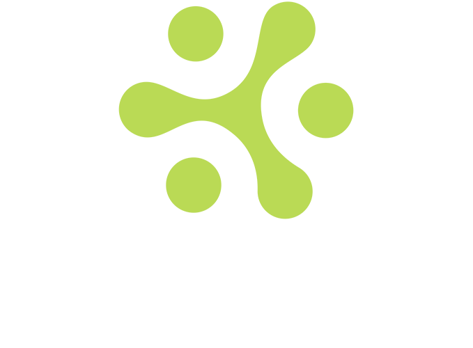
Icon · The Synapse · four contexts





The Synapse is always brand green (#bada55). Static contexts: a version on a black ground for dark surfaces, a version on a light ground for light surfaces, a transparent version that sits on whatever surface it’s placed on. The animated variant powers loaders on the live site.
05 · Voice
Two straplines.
A primary line that does most of the work, and a secondary line that runs longer when more context is warranted. Both are fixed wording — neither is paraphrased, neither is rewritten for length.
PRIMARY
Recruitment.
Reengineered.
Fully managed.
SECONDARY
Smarter automation.
Seamless experiences.
Recruitment reengineered.
How we write.
Rules about register and construction, not about what we sell. Product claims live in product material and change more often than this document should.
Claims, not labels
A headline states something arguable. “How we got here” is a label; “Connect was not the plan” is a claim. Labels make the reader wait for the point. Claims give it to them.
Plain words, full sentences
No leverage, no synergies, no solutioning. British spelling. Sentence case in body copy, uppercase reserved for eyebrows. If a sentence needs a comma to survive, it gets one.
Concede something real
Naming what we do not do, what cost us, or what a competitor genuinely does well earns the right to the rest. Copy with nothing conceded reads as marketing and gets discounted accordingly.
Numbers are specific or absent
“Usually an hour” beats “quickly”. If we cannot be specific we say nothing rather than reaching for “significant”, “robust” or “industry leading”.
Name others from the record
When we describe another company we describe what it publishes about itself, and we can point to the source. Never characterise a third party as unofficial, unsanctioned or unsafe without one.
Accuracy about our own history
The founders co-founded Invenias and held senior roles at Bullhorn after its acquisition. We never say we built Bullhorn. Where the true version is less impressive, we use the true version.
06 · Typography
One family. One scale.
Poppins for everything. The wordmark is Comfortaa Bold, but it's set as an SVG — it doesn't appear in the live type stack. Comfortaa is documented here for reference and for the cases where it does need to be rendered as text.
Type families
Poppins
Used for everything: headings, body, UI, buttons, eyebrows, captions. Light (300) for hero and body large. Regular (400) for section titles and most body. Medium (500) for subheadings. Semi-bold (600) for buttons and eyebrows.
Comfortaa
Used only for the Exenai wordmark. Bold 700. Now shipped as an SVG so the live site doesn't load Comfortaa as a webfont. Documented here for reference and for environments where the text version is required (email signatures, system fallbacks).
System UI
For Word documents, email signatures, and any environment without webfont access, fall back to Arial or the OS system font. Never Calibri, never Times.
Type scale
Sizes shown are the desktop reference. Mobile scales down by ratio, with H1 clamping to 38px and body type never below 14px.
07 · Components
The shared library.
Built once as shared components. Used across every page. Never restyled locally — if a component needs to change, the change happens at the source and propagates.
Buttons
Exenai green button
Used for the lead CTA on every page: hero, mid-page conversion, and the close. The single most-pressed button in the brand.
Transparent with border
Used as the secondary CTA next to the primary green button. Less weight, same hierarchy.
Compact green pill
Used in the header only. The standing CTA that sits in the nav across every page.
Cards
Surface card on dark
Body copy in the card sits at 13px on the small body scale. Dark surface, default border, hover bumps the border to emphasis.
Surface card on light
The light variant for sections set on off-white or warm grey. Same radius, same padding, same hierarchy.
Tag pill
Tag with status dot
Used in hero sections to flag context — partner status, page topic, system register. Dot colour swaps to signal product or partner.
Inline status badges
Used on catalogue and listing cards to carry status, category or attribution. A badge is a container plus an inner text element, expanded or collapsed rather than hidden with opacity.
08 · Presentation system
Decks are the system, at full screen.
Exenai presentations are single HTML files, not slide software. Every section is one full screen, navigated with a button or the keyboard. They inherit the same surfaces, type and components as everything else — which is why a deck takes an afternoon rather than a week.
Slide anatomy
Eyebrow, headline, subtitle
In that order, every time. The eyebrow orients, the headline claims, the subtitle argues. A slide missing the eyebrow reads as though it belongs to a different deck.
Two to five columns
g2 through g5, collapsing to two columns under 1000px and one under 680px. Five is the maximum and only for short cards.
Footnote or callout, never both
End on one of them. A slide carrying an italic footnote and a callout is two endings, and the second one wins by accident.
Callout · the quiet pull quote
Replaces the solid green block used in v1.0. A two pixel green rule fading downward, body scale type at regular weight. It reads as emphasis rather than as a highlighter, and it survives being used twice in one deck.
Emphasis card
Dark text on green does not scale
A solid green card is loud enough that a second one on the same slide cancels the first. It also forces dark text, which breaks the type hierarchy that holds everywhere else. The emphasis card keeps white text, keeps the hierarchy, and can sit beside three normal cards without shouting over them.
Solid green is still correct for exactly one thing on a slide: the element that is the answer. A gateway in a flow diagram, a headline number, a primary button.
Icon squares
Horizontal rail · for anything sequential
Numbered rows & statistics
One solid green statistic per slide at most, and only when that number is the point of the slide.
Deck chrome
A deck opens closed
A near-empty screen with the deck name in muted small caps and a single Start button. It holds the title animation until the room is ready, and it tells the presenter which deck they are in.
Bar, count, dots
A two pixel green progress bar across the top, a slide count top right in tabular numerals, and a column of dots on the right edge that double as navigation.
Back and Next, bottom right
Ghost and primary buttons. Arrow keys, page keys and space also move. The last slide turns Next into Back to start.
Corner lockup, after the title
The lockup appears in the top left from slide two onward, never on the title slide, where the full lockup is already the hero.
Partner lockups
Match the text, not the box
Two logos sit together correctly when their wordmark heights match and their baselines align, not when their bounding boxes match. Measure the text band and the baseline offset in each asset, then scale from that. Exenai’s wordmark occupies 88% of its box height; most other marks sit far lower in theirs.
A thin plus, centred on the text
Set in the muted tier at light weight, vertically centred on the shared text band rather than on the overall lockup, so it does not drift upward when one mark is taller.
Host brand first
Exenai leads on our own material. On co-branded material for a partner audience, whichever brand the room belongs to leads. Never lock up with a partner mark on a deck that criticises them.
Building a deck as an HTML artefact
Exenai decks are produced by describing them to Claude and iterating on the result. What follows is the construction Claude should use, so that a deck built in one conversation matches one built in another. Give this document to the model and ask for a deck; it should not need to invent any of this.
One self-contained file
A single .html file with everything inline: styles, script, and every image as a base64 data URI. No build step, no external assets, no CDN beyond the Google Fonts link. It has to work from a laptop with no internet in a meeting room, and it has to survive being emailed.
Sections are screens
A scroll-snapping container, one section per screen, each a flex column that is vertically centred. Content is written to fit 900px of height at 1440px wide; if it overflows, the copy gets cut rather than the type shrunk.
Chrome is fixed, not per slide
Progress bar, slide count, dot navigation, Back and Next, and the corner lockup all live outside the deck container and persist. The corner lockup is hidden on the title slide and fades in from slide two.
Reveal on entry, not on load
An IntersectionObserver adds a class when a section comes into view; elements marked to rise translate up and fade in with a small stagger. It makes a deck feel deliberate without anything animating twice.
The start gate holds the room
The deck opens on a near-empty screen carrying the deck name in muted small caps and a single Start button. Nothing on the title slide animates until it is pressed, so the reveal happens when the presenter is ready rather than while they are still sharing their screen.
The shell
<body>
<div id="gate"><div class="gwrap">
<p class="gdeck">Deck name · audience</p>
<button id="startBtn">Start</button>
</div></div>
<!-- persistent chrome, outside the deck -->
<div id="bar"></div> progress
<div id="brand">…</div> corner lockup, hidden on slide 1
<div id="count">01 / 12</div>
<div id="dots"></div>
<div id="nav"><button id="prev">Back</button><button id="next">Next</button></div>
<main id="deck">
<section class="hero intro"> … </section> title
<section> … </section> content
<section class="hero"> … </section> close
</main>
</body>Snapping and section layout
#deck { height:100dvh; overflow-y:scroll; scroll-snap-type:y mandatory; }
#deck section {
  min-height:100dvh; scroll-snap-align:start; scroll-snap-stop:always;
  display:flex; flex-direction:column; justify-content:center;
  padding:96px var(--pad) 120px;
}
/* reveal on entry */
.rise { opacity:0; transform:translateY(16px);
        transition:opacity .55s ease, transform .55s cubic-bezier(.22,1,.36,1); }
section.live .rise { opacity:1; transform:none; }
section.live .rise:nth-child(2) { transition-delay:.05s; }
section.live .rise:nth-child(3) { transition-delay:.10s; }
Navigation
var io = new IntersectionObserver(function (entries) {
  entries.forEach(function (x) {
    if (x.isIntersecting) {
      x.target.classList.add('live');
      i = slides.indexOf(x.target); paint();
    }
  });
}, { threshold: .55 });
slides.forEach(function (s) { io.observe(s); });

// keys: down / right / page down / space advance, up / left / page up go back,
// home and end jump to the ends. The last slide turns Next into Back to start.
function paint() {
  bar.style.width = ((i + 1) / slides.length * 100) + '%';
  count.textContent = pad(i + 1) + ' / ' + pad(slides.length);
  document.body.classList.toggle('past-hero', i > 0);   // corner lockup
}
The title sequence
Four beats over roughly three seconds, and none of them run until Start is pressed. The icon mark travels in and settles, the wordmark wipes in behind it, any partner mark and separator fade up, then the eyebrow, headline and subtitle rise in sequence. Everything is gated on a single class on the body so the whole sequence can be held or replayed.
/* nothing on the title runs until the gate is dismissed */
.lockup .mark { transform-box:fill-box; transform-origin:center; opacity:0; }
.lockup .type { clip-path:inset(-20% 0 -20% 100%); }
section.hero.intro .eyebrow,
section.hero.intro h1,
section.hero.intro .sub { opacity:0; }

body.started .lockup .mark { animation:markFly 2.1s both; }
body.started .lockup .type { animation:wipeReveal 1.2s cubic-bezier(.5,0,.2,1) .92s both; }
body.started section.hero.intro .eyebrow { animation:fadeUp .7s ease 2.45s both; }
body.started section.hero.intro h1      { animation:fadeUp .7s ease 2.60s both; }
body.started section.hero.intro .sub    { animation:fadeUp .7s ease 2.75s both; }

@keyframes wipeReveal { from { clip-path:inset(-20% 0 -20% 100%) }
                        to   { clip-path:inset(-20% 0 -20% 0) } }
@keyframes fadeUp     { from { opacity:0; transform:translateY(14px) }
                        to   { opacity:1; transform:none } }
Two things that will bite. Gate the animations to body.started and scope them to the title hero only — a closing hero sharing the class inherits a timer that expired minutes ago and never appears. And any keyframe using both must set its final opacity explicitly, or fill-mode reverts the element to the hidden base state.
Assets
Inline the SVG, embed the rest
The Exenai mark goes in as inline SVG so its parts can be animated and coloured with tokens. Partner marks and photographs are trimmed to their bounding box, scaled once, and embedded as base64 PNG.
Drawn, not imported
Inline SVG on a 24 grid, single green stroke at 1.6, round caps and joins. No icon library, no filled glyphs, no emoji.
Render before delivering
Screenshot every slide at 1440×900 and look at it. Overflow, clipped footnotes and text colliding with the navigation are invisible in the markup and obvious in the image.
Asking Claude for one
Build a presentation as a single self-contained HTML file, following the
Exenai Design System at exenai.design: dark surfaces, Poppins, green used
once per slide, scroll-snapped full-screen sections, start gate, and the
title sequence described in the presentation system section.

Audience:   who is in the room and what they already know
Purpose:    the one decision or action the deck is for
Sections:   the argument, in order, one idea each
Assets:     logos and data to embed

Write headlines as claims rather than labels. Concede something real.
Screenshot every slide at 1440x900 before returning it.
The last two lines matter more than they look. Without them a model reliably produces labelled slides, uniformly positive copy, and layouts that overflow at the bottom of the screen where nobody checked.
09 · Page architecture
Sections that alternate.
Pages follow a rhythm rather than a template: dark, dark, light, dark, light. The shape below is the default; the section names change with the content, the alternation does not.
- Hero
- Proof strip
- The problem
- What we do
- Why us
- Detail
- Evidence
- The ask
- Footer
- Never three light sections in a row
- Open dark, close dark
- Strips are deepest, and short
- A light section carries the dark text scale
- Section order is content, not decoration
A page that is dark all the way down reads as one long block and the reader stops noticing where they are. The light sections act as breathing points and give the eye somewhere to land. The alternation is what makes a site feel like a brand rather than a sequence of components.
Layout tokens
1200px content · 1440px max
Main content sits in a 1200px column. The page background spans 1440px maximum. Beyond that, content is centred and the surrounds are flat.
52px desktop · 24px mobile
Left and right page padding. Section vertical padding is 108px on standard sections, 40 to 52px on short strip sections.
Eyebrow · headline · body
14px from eyebrow to headline. 16–18px from headline to body. 36–40px from body to button. The rhythm is the same on every section.
10 · 8 · 20
Cards 10px, buttons 8px, pills 20px. No other radii used. Consistency over variety — same shape language everywhere.
10 · Usage
How the system stays the system.
Six rules. Each protects the system from the small drifts that accumulate into "we used to have a brand". None of these are stylistic preferences; they're the contract.
Borrowed accents stay borrowed
Toca Pink and Bullhorn Orange are other companies’ colours. They appear only where we are referring to those companies, never to colour something of ours, and never decoratively.
Exenai green is rare, and solid green rarer still
Green carries the most weight in the system. Once for the eyebrow and once for the primary action, per page or per slide. A solid green fill is reserved for the single element that is the answer — never two on one screen.
Dim variants never carry text
The 8% dim variants of green, blue, pink, and orange are for pill backgrounds only. Text on dim fails contrast. Text uses the full accent or the on-light text variants.
Shared components only
Buttons, cards, dividers, header, footer — all built once as shared components. Never restyled per page. If a change is needed, the source updates and propagates.
Type stays Poppins
No second display face. No serif accents. No swapping in a different family for "personality". Personality comes from green, from the dark register, and from the voice — not from the typeface.
Foundation is canon
Surfaces, borders, text colours, and the type scale don't fork per page. If a token isn't working, the system gets revised. The page doesn't override it locally.
A deck is a surface, not an exception
Presentations use the same tokens and the same components as everything else. A pattern invented for a deck either earns its way into this document or it gets removed from the deck.
One ending per slide
A footnote or a callout, never both, and never a callout immediately followed by another card. The last thing on the screen is the thing the room remembers.
11 · Governance
Maintaining the system.
The system is the source. It governs every Exenai surface — websites, customer-facing applications, internal tools, decks, documents, partner artefacts. Each of those is an implementation; none of them is the source. This document is the canonical reference, and any implementation that diverges from it is wrong.
exenai.design
Public. The single canonical reference for the Exenai brand and design system, for our own team, our partners, and anyone building alongside us. Every Exenai product is built against what is here.
One system. Many surfaces.
Marketing site, product applications, internal tooling, presentations, MSAs, partner one-pagers — all draw from the same source. The system holds across them. It is platform independent and travels with the brand.
Rich Harrison · Exenai
The system, the foundation tokens, the type scale, the voice rules, the components. Material changes go through the owner before any implementation reflects them. Observations and proposals from the team and partners are welcome and considered for the next version.
v1.1 · August 2026
Material changes are versioned. v1.1 adds the presentation system, clarifies that Exenai green carries all of our products while Toca Pink and Bullhorn Orange are borrowed, and moves the document to a public home. Previous versions are preserved for reference.